Samuel Furfari, Professeur à l’Université libre de Bruxelles,
et Henri Masson, Professeur (émérite) à l’Université d’Antwerpen
Is it the increase of temperature during the period 1980-2000 that has triggered the strong interest for the climate change issue? But actually, about which temperatures are we talking, and how reliable are the corresponding data?
1/ Measurement errors
Temperatures have been recorded with thermometers for a maximum of about 250 years, and by electronic sensors or satellites, since a few decades. For older data, one relies on “proxies” (tree rings, stomata, or other geological evidence requiring time and amplitude calibration, historical chronicles, almanacs, etc.). Each method has some experimental error, 0.1°C for a thermometer, much more for proxies. Switching from one method to another (for example from thermometer to electronic sensor or from electronic sensor to satellite data) requires some calibration and adjustment of the data, not always perfectly documented in the records. Also, as shown further in this paper, the length of the measurement window is of paramount importance for drawing conclusions on a possible trend observed in climate data. Some compromise is required between the accuracy of the data and their representativity.
2/ Time averaging errors
If one considers only “reliable” measurements made using thermometers, one needs to define daily, weekly, monthly, annually averaged temperatures. But before using electronic sensors, allowing quite continuous recording of the data, these measurements were made punctually, by hand, a few times a day. The daily averaging algorithm used changes from country to country and over time, in a way not perfectly documented in the data; which induces some errors (Limburg, 2014) . Also, the temperature follows seasonal cycles, linked to the solar activity and the local exposition to it (angle of incidence of the solar radiations) which means that when averaging monthly data, one compares temperatures (from the beginning and the end of the month) corresponding to different points on the seasonal cycle. Finally, as any experimental gardener knows, the cycles of the Moon have also some detectable effect on the temperature (a 14 days cycle is apparent in local temperature data, corresponding to the harmonic 2 of the Moon month, Frank, 2010); there are circa 13 moon cycle of 28 days in one solar year of 365 days, but the solar year is divided in 12 months, which induces some biases and fake trends (Masson, 2018).
3/ Spatial averaging
First of all, IPCC is considering global temperatures averaged over the Globe, despite the fact that temperature is an intensive variable, a category of variables having only a local thermodynamic meaning, and also despite the fact that it is well known that the Earth exhibits different well documented climatic zones.
The data used come from meteo stations records, and are supposed to be representative for a zone surrounding each of the meteo stations, and which is the locus of all points closer to that given station than to any other one (Voronoï algorithm) . As the stations are not spread evenly and as their number has changed considerably over time, “algorithmic errors” are associated to this spatial averaging method.
VORONOI DIAGRAM
“In mathematics, a Voronoi diagram is a partitioning of a plane into regions based on distance to points in a specific subset of the plane. That set of points (called seeds, sites, or generators) is specified beforehand, and for each seed there is a corresponding region consisting of all points closer to that seed than to any other. These regions are called Voronoi cells.
[source: https://en.wikipedia.org/wiki/Voronoi_diagram ]
As the number of seed points changes, their corresponding cells change in shape, size and number (Figs. 1 and 2).


Diagrams constructed with http://alexbeutel.com/webgl/voronoi.html
In climatology, the seed points are the meteo stations, and their number has been considerably reduced over time, which changes the number and size of the corresponding cells (see Figs. 3, 4 and 5).
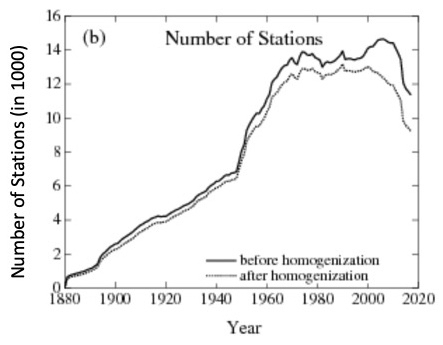
Source : https://data.giss.nasa.gov/gistemp/station_data_v4_globe/

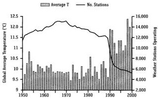
Fig. 5 : Evolution of land stations and global temperature (Easterbrook 2016) [7]. Beginning of 1990, thousand meteo stations located in cooler rural zones (e.g. Siberia, North Canada) stopped recording data (source :ftp://ftp.ncdc.noaa.gov/pub/data:ghcn/v2/v2.temperature.readme). Note that Fig. 3 is based on GHCNv4 (June 2019) and Fig. 5 on GHCNv2 (before 2011). All stations have been reanalyzed and that’s why there are differences between the two figures.
Average temperature
The average temperature (actually its anomaly; see below) is calculated by summing the individual data from the different stations and by giving to each point a weight proportional to its corresponding cell (weighted average).
As the sizes of the cells have changed over time, the weight of the seed points (the meteo stations) have also changed, which induces a bias in the calculation of the global average value.
Applying a Voronoï algorithm opens clearly the door to any kind of manipulation in zones where the data are sparse, as shown in Figure 6.
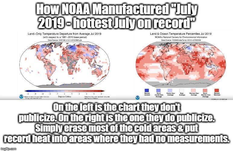
Figure 6. Source : https://www.ncei.noaa.gov/news/global-climate-201907
4/ Urban island effect
Also, many meteo stations were initially located on the countryside, but these locations became progressively urbanized, causing an “urban island” effect, increasing artificially the measured temperature (Figs 7 and 8).
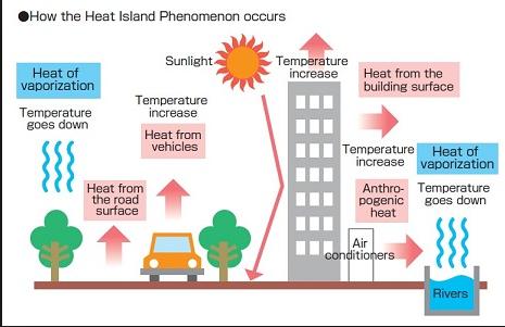
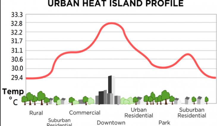
As a consequence, for land station data to be useful, it is essential that any non-climatic temperature jumps , such as the urban island effect, are eliminated. Such jumps may also be induced by moving the location of the stations or by updating the equipment. In the adjusted data form GISTEMPv4 . the effect of such non-climatic influences is eliminated whenever possible. Originally, only documented cases were adjusted, however the current procedure used by NOAA/NCEI applies an automated system based on systematic comparisons with neighboring stations to deal with documented and undocumented fluctuations that are not directly related to climate change. The protocols used and evaluation of these procedures are described in numerous publications — for instance [2, 3].
However, correcting an urban island effect by homogenizing the data coming from meteo stations located in the vicinity, and which remained away from urbanisation, induces some pervert effect leading to fake conclusions. Indeed, just as the data from the « urbanized » station are tempered by the data from the other stations, the data of those ones are also affected by the data coming from the urbanized station and become somewhat corrupted by the urban island effect. This mutual influence, the perverse effects of it, and the fake conclusions reached, are well illustrated, in a stepwise manner, by the case described in this video :
5/ Sea surface temperature
And what about the temperature over the oceans (representing about 70% of the Earth surface)? Until very recently, these temperatures have been only scarcely reported, as the data for SST (Sea Surface Temperature) came from vessels following a limited number of commercial routes (Fig. 9).
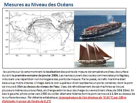
More recently Argo floats (buoys) were spread over the oceans, allowing a more representative spatial coverage of SST.
6/ Temperature anomalies
Secondly, at a given moment, the temperature on Earth may vary by as much as 100°C (between spots located in polar or equatorial regions). To overcome this problem, IPCC is not referring to absolute temperature but to what is called “anomalies of temperature”. For that, they first calculate the average temperature over fixed reference periods of 30 years: 1931-60, 1961-1990. The next period will be 1991-2020. They then compare each annual temperature with the average temperature over the closest reference period. Presently and up to year 2021, the anomaly is the difference between the ongoing temperature and the average over the period 1961-1990.
This method is based on the implicit hypothesis that the “natural” temperature remains constant and that any trend detected is caused by anthropogenic activities. But even so, one may expect having to proceed to some adjustments, when switching from one reference period to another, a task interfering with the compensation of an eventual “urban island” effect or with a change in the number of meteo stations when switching from one reference period to the other, two effects we have identified as sources of error and bias.
But, actually, the key problem is that the temperature records undergo locally natural polycyclic, not exactly periodic and non-synchronized fluctuations [4]. The fact that those fluctuations are not exactly periodic makes it mathematically impossible to “detrend” the data, by subtracting a sinusoid, as is commonly done, for example, when eliminating seasonal effects from data.
The length of these cycles range from one day to annual, decennial, centennial, millennial components and beyond up to tenths of thousands of years (the Milankovich cycles).
Of particular interest for our discussion are decennial cycles, as their presence has a triple consequence:
Firstly, as they cannot be correctly detrended, because they are a-periodic, they interfere with, and amplify an eventual anthropogenic effect that is tracked in the anomalies.
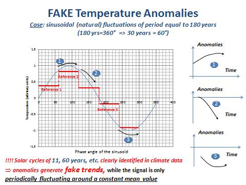
Secondly, they induce biases and fake anomalies in calculating the average temperature over the reference period, as shown in Figure 10 below (Masson, [5]).
Comment on Fig. 10
The figure shows the problems associated to defining an anomaly when the signal exhibits a periodic signal of length comparable to the reference period used for calculating this anomaly. To make the case simple, a sinusoid is considered of period equal to 180 years (a common periodicity detected in climate related signals), thus 360° = 180 years, and 60° = 30 years (the length of the reference period used by IPCC for calculating anomalies). For our purpose, 3 reference periods of 60° (30 years) have been considered along the sinusoid (the red horizontal lines marked reference 1, 2 and 3). On the right side of the picture, the corresponding anomalies (measurement over the next 30 year minus the average value over the reference period) have been represented. It can be seen, obviously, that the anomalies exhibit different trends. Obviously also, all those trends are fake because the real signal is a sinusoid of overall mean value equal to zero. In other words there is no trend, only a periodic behaviour.
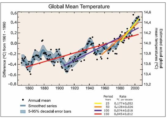
The third fundamental critic on the way IPCC is handling temperature data relates to their choice to rely exclusively on linear regression trend lines, despite the fact that any data scientist knows that one must at least consider a time window exceeding 5 times the period of a cyclic component present in the data to avoid “border effects”. Bad luck for IPCC, most of the climate data shows significant cyclic components with (approximate) periods of 11, 60 and 180 years, while on the other hand they consider time windows of 30 years for calculating their anomalies.
And so, IPCC creates artificial “global warming acceleration” by calculating short term linear trends from data exhibiting a cyclic signature. With Figure 11 taken from FAQ 3.1 from Chapter 3 of the IPCC AR4 2007 report [6] IPCC states “Note that for shorter recent periods, the slope is greater, indicating accelerated warming ».
The following graph (Fig. 12) illustrates the issue.
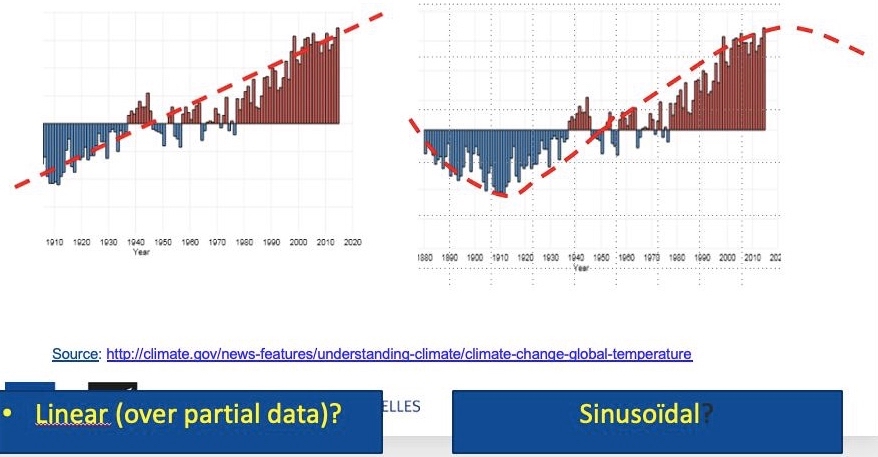
Comment on Fig. 12.
The graph shows the average annual global temperature since 1880 compared not with a 30 years reference period (as done for calculating anomalies), but compared to the long-term average from 1901 to 2000. The zero represents the long-term average for the whole planet, the bars show the global (but long term) “anomalies” above or below the long term average versus time. The claimed linear trend represented on the left part of the figure is (more than probably), as shown on the right part of this figure, nothing else than the ascending branch of a sinusoid of 180 years. This is also another way (the correct and simplest one?) to explain the existence of the “pause” or “hiatus” that has been observed over the last 20 years. The “pause” corresponding to the maximum of the sinusoid, and, consequently, a global cooling period could be expected during the coming years.
7/ Linear trend lines and data having a cyclic signature
Finally, the followings graphs (Figs 13–15, from Masson [5] illustrate the “border effect” mentioned previously for a schematic case and show the potential errors that can be made, when handling with linear regression methods, data having a cyclic component with a (pseudo-) period of length comparable to the time window considered. The sinusoid remains exactly the same (and shows no trend), but if one calculates the linear regression (by the least square method) over one period of the sinusoid, a FAKE trend line is generated and its slope depends on the initial phase of the time window considered.
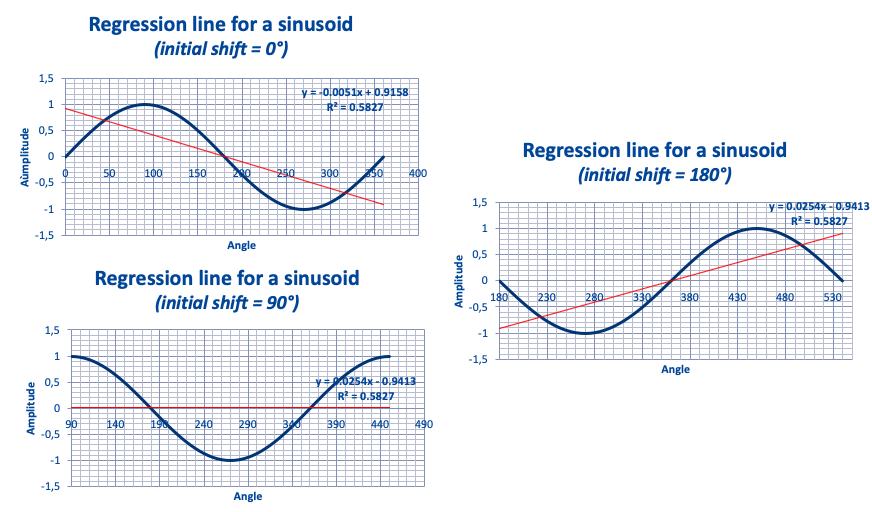
Figs 13–15. Linear regression line over a single period of a sinusoid.
Regression lines for a sinusoid.
To illustrate the problem associated to the “Border effect” when drawing the regression line for a sinusoid, let us consider a simple sinusoid and calculate the regression line over one, two, five, … many cycles (Figs 16–18).
The sinusoid being stationary, the true regression line is a horizontal line (with a slope = 0).
Taking an initial phase of 180° (to generate a regression line with a positive slope), let us see how the slope of the regression line changes with the number of periods:
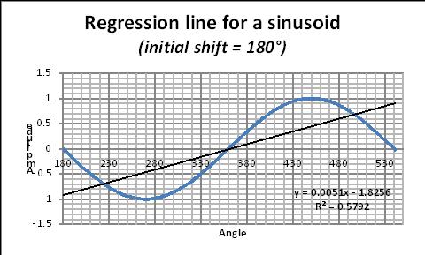
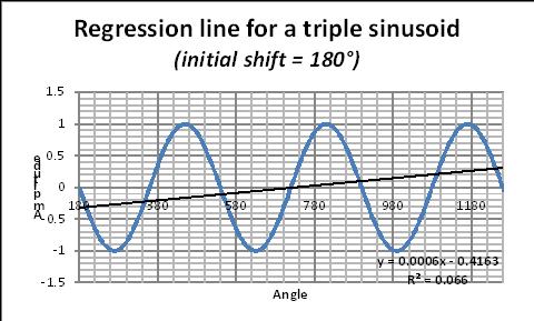
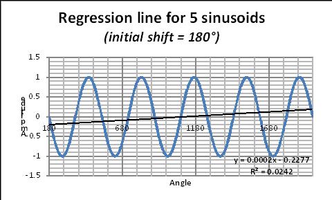
Figs 16–18. Regression line for sinusoids with one, two, five cycles.
The corresponding regression equation is given on each figure. In this equation, the coefficient of x gives the slope of the “fake” regression line. The value of this slope changes with the number of periods as given on Fig. 19. As a thumb rule, data scientists recommand to consider at least 6 periods.
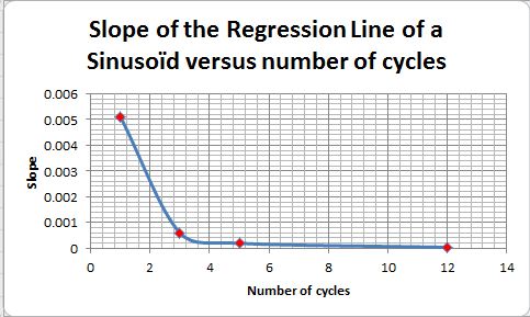
See also this Excel illustration (here).
8/ An illustratative case
The considerations developed earlier in this paper may probably look obvious to experimented data scientists, but it seems that most of the climatologists are not aware of (or try to hide ?) the problems associated to the length of the time window considered and its initial moment. As a final illustration, let us consider “official” climate data and see what happens when changing the length of the time window considered and its initial instant (Figs 20–22). From this example, it is obvious that linear trend lines applied to (poly)-cyclic data of period similar to the length of the time window considered, open the door to any kind of fake conclusions, if not manipulations aimed to push one political agenda or another.
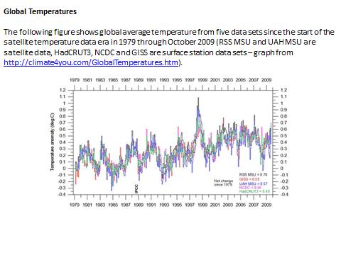
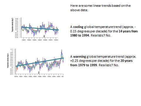
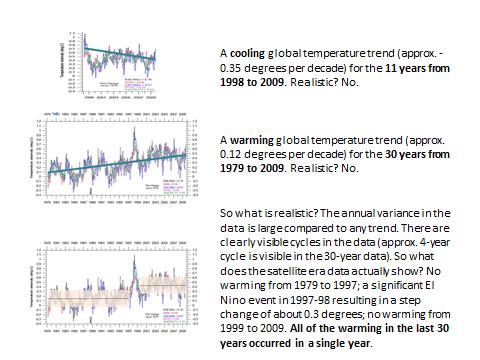
Fig. 22. Effect of the length and initial instant of a time window on linear trend lines (ctnd).
Conclusions
– IPCC projections result from mathematical models which need to be calibrated by making use of data from the past. The accuracy of the calibration data is of paramount importance, as the climate system is highly non-linear, and this is also the case for the (Navier-Stokes) equations and (Runge-Kutta integration) algorithms used in the IPCC computer models. Consequently, the system and also the way IPCC represent it, are highly sensitive to tiny changes in the value of parameters or initial conditions (the calibration data in the present case), that must be known with high accuracy. This is not the case, putting serious doubt on whatever conclusion that could be drawn from model projections.
– Most of the mainstream climate related data used by IPCC are indeed generated from meteo data collected at land meteo stations. This has two consequences:
(i) The spatial coverage of the data is highly questionable, as the temperature over the oceans, representing 70% of the Earth surface, is mostly neglected or “guestimated” by interpolation;
(ii) The number and location of theses land meteo stations has considerably changed over time, inducing biases and fake trends.
– The key indicator used by IPCC is the global temperature anomaly, obtained by spatially averaging, as well as possible, local anomalies. Local anomalies are the comparison of present local temperature to the averaged local temperature calculated over a previous fixed reference period of 30 years, changing each 30 years (1930-1960, 1960-1990, etc.). The concept of local anomaly is highly questionable, due to the presence of poly-cyclic components in the temperature data, inducing considerable biases and false trends when the “measurement window” is shorter than at least 6 times the longest period detectable in the data; which is unfortunately the case with temperature data.
– Linear trend lines applied to (poly-)cyclic data of period similar to the length of the time window considered, open the door to any kind of fake conclusions, if not manipulations aimed to push one political agenda or another.
– Consequently, it is highly recommended to abandon the concept of global temperature anomaly and to focus on unbiased local meteo data to detect an eventual change in the local climate, which is a physically meaningful concept, and which is after all what is really of importance for local people, agriculture, industry, services, business, health and welfare in general.
[1] The GISS Surface Temperature Analysis (GISTEMP v4) is an estimate of global surface temperature change. It is computed using data files from NOAA GHCN v4 (meteorological stations), and ERSST v5 (ocean areas), combined as described in Hansen et al. (2010) and Lenssen et al. (2019) (see : https://data.giss.nasa.gov/gistemp/). In June 2019, the number of terrestrial stations was 8781 in the GHCNv4 unadjusted dataset; in June 1880, it was only 281 stations.
[2] Matthew J. Menne, Claude N. Williams Jr., Michael A. Palecki (2010) On the reliability of the U.S. surface temperature record. JOURNAL OF GEOPHYSICAL RESEARCH, VOL. 115, D11108, doi:10.1029/2009JD013094, 2010.
[3] Venema VKC et al. (2012) Benchmarking homogenization algorithms for monthly data. Clim. Past, 8, 89-115, 2012.
[4] F.K. Ewert (FUSION 32, 2011, Nr. 3 p31)
[5] H. Masson,Complexity, Causality and Dynamics inside the Climate System (Proceedings of the 12thannual EIKE Conference, Munich November 2018.
[6] IPCC, http://www.ipcc.ch/pdf/assessment-report/ar4/wg1/ar4-wg1-chapter3.pdf]
[7] Easterbrook D.J. (2016) Evidence-based climate science. Data opposing CO2 emissions as the primary source of global warming. Second Edition. Elsevier, Amsterdam, 418 pp.
Dans ces conditions quel est le sens d’avoir une température moyenne pour toute la planète?
Est-ce de pouvoir mesurer un réchauffement ou refroidissement global?
Est-ce la seule manière d’évaluer un changement climatique?
Etant donné que toute l’énergie vient du soleil, n’est-il pas plus réaliste de mesurer l’équilibre réception-émission de la terre?.
Comme démontré dans l’article, l’anomalie de température moyenne globale est un indicateur climatique entaché de nombreuses erreurs et dont le sens physique peut-être mis en doute (la température étant une grandeur intensive).
On peut aussi se rappeler que la météo est essentiellement définie-prédite, non par des thermomètres, mais par des baromètres, les différences de pression entre un cyclone et un anti-cyclone définissant les vents (courants convectifs) chauds ou froid balayant un point donné du globe.
Neamoins, si l’on se focalise sur les températures comme indicateur climatique, , il vaut mieux travailler avec des grandeurs locales et détecter des fluctuations locales de température,comme suggéré dans les conclusions.
Pour ce faire, une façon élégante de procéder consiste à faire un bilan d’énergie local à l’interface océan-atmophère (70% de la surface terrestre) ou sol-atmosphère, comme vous le suggérez.
Un modèle récemment développé par Arthur Rörsch (
working paper http://www.arthurrorsch.com, basé sur D.L. Hartman, Global Physical Climatology (Ch 4), 1994) va dans ce sens
Des fluctuations poly-cycliques d’intensité solaire (d’origine astrophysique) définissent les tendances locales à plus ou moins long terme et les accidents météo (couverture nuageuse, vents chauds ou froids, tempêtes de sable) voire géophysiques (eruptions volcaniques) sont « absorbés » par un système de régulation de température local composé de l’évaporation-condensation de la vapeur d’eau (la chaleur latente d’évaporation-condensation étant énorme ~2500 KJ/kg) et par le rayonnement IR réemis par l’interface considéré. Ce système de régulation agit comme un « attracteur chaotique » extêmement puissant, ramenant la température à une valeur (saisonière) normale en quelques jours. La détection d’un changement climatique LOCAL se fait alors en analysant, avec des méthodes statisitiques conventionnelles, l’évolution (ou non) en fonction du temps des paramètres du modèle.
Que d’éléments il y a à intégrer parmi vos huit considérations !
En fonction de quoi, je m’interroge sur les deux aspects suivants :
1° IPCC-GIEC postule une « moyenne » couvrant l’étendue des 70% océaniques et le reste terrestre, loin d’être géographiquement équi-répartie (cette concentration extrême de stations fixes au sol ; une dispersion géo-variable en mer). Or ceci ne me semble pas s’équilibrer simplement par les « cellules de Voronoi », éventuellement élargies sur les étendues maritimes !
2° Pour obtenir une comparabilité rigoureuse, cette « température moyenne » doit se calculer à saisons et heures régulièrement fixées (votre 2/ ), de préférence à une altitude présumée « normalisée sur le globe ». On y mesure la T° ponctuelle de l’air. Mais quelles masses d’air, en dépit de leurs « time series analysis » ? Car chacun sait (nos météorologues en premier, les marins et aviateurs en situation…) que les effets de vents (courants fluctuants) au sol – en mer – en altitude sont difficilement reproductibles de périodes en périodes.
Ce bilan d’énergie local (invoqué en vos commentaires ci-dessus) peut-il pallier des effets par nature non-linéaires ?
Il s’agirait là d’une prouesse de méthodologies correctrices afin d’obtenir une similitude de leurs projections GIEC. Ceci n’étant pas aisément corrigé par l’usage de mesure*modèles satellitaires, eux-mêmes sur trajectoire parfois obstruée par la couverture nuageuse ! Un lecteur peut-il m’éclairer ?
# Emmanuel Simon:
1- pour la représentativité spatiale, vous avez parfaitement raison: les données relevées aux stations terrestres, enrichies par les relevés de température d’eau de surface effectués à partir de navires, ne peuvent en aucun cas être représentatives d’un climat global. Depuis quelques années les bouées Argo pallient à cet inconvénent, mais là on se heurte à un autre problème soulevé dans l’article: les « effets de bord » associés à la longueur de la fenêtre de mesure (pas plus de deux décennies) comparée aux périodes des fluctuations cycliques des données (11 ans, 18 ans, 60 ans, 180 ans, etc.). Les mesures par satellite (entachées de gros problème de calibrage et de dérive) permettent des relevés plus représentatifs, mais là aussi on ne dispose de données que sur quelques décennies (grosso modo une cinquantaine d’années) et on se retrouve confronté au problème des « effets de bord » déjà mentionné.
2- Comme indiqué dans l’article, je pense que l’approche du bilan de chaleur LOCAL à l’interface océan-atmosphère (ou sol-atmosphère) est plus rigoureuse que celle suivie par le GIEC (qui associe l’atmosphère à un corps gris). Les 4 paramètres du modèle d’Arthur Rörsch intégrent les effets de la couverture nuageuse que vous mentionnez(en modulant l’amplitude des signaux polycycliques d’énergie radiante incidente, qui est un des 4 paramètres du modèle). L’effet du vent, que vous mentionnez également, est répercuté quant à lui sur le coefficient de transfert de chaleur convectif (caché dans le coefficient du terme en T° de l’équation), car en effet « pour refroidir son potage on souffle sur sa surface, ou mieux sur le contenu de sa cuillère (aussi élégament que possible) ». En termes plus choisis, le transfert de chaleur par convection forcée (en présence de vent) est plus important que celui par convection naturelle (air au repos).
Comme suggéré dans l’article, suivre, localement à chaque station météo, l’évolution de la valeur des paramètres du modèle en fonction du temps, et l’analyser avec des tests statistiques simples, permet de conclure à un changement climatique LOCAL, à des fluctuations naturelles poly-cycliques, etc. et cela sans aucune ambiguïté ni erreur algorithmique du même ordre de grandeur que l’effet (éventuel) que l’on veut mettre en évidence, deux faiblesses méthodologiques majeures des méthodes utilisées par le GIEC.
Thank you, interesting article. However, I must ask you about fig. 5: according to the figure, the ”global temperature” would have jumped by more than one degree Celsius about 1990, from perhaps 10 degrees to 11. While the graph hints at a spectacular correlation between temperature and number of reporting stations, it does not look credible? I thought the global temperature (if it can even be measured?) is between 14 and 15 degrees.
Perhaps you could check the source of fig. 5 and comment on the above. I do understand this does not affect the actual conclusions of your article, but…..
Claes Ehrnrooth
Actually the sketch in Fig 5. illustrates the mean value of the temperatures measured at the remaining meteo stations, without taking into account the Voronoï algorithm developed under heading 3, and defining the « control area » of a given meteo station . The figures results from a sum of individual data, NOT from a weighted sum. And as the meteo stations are relatively sparely dispersed in the intertropical zone, and over represented in the US and in Europe, the (unweighted) mean value is lower than the reference one used by IPCC for computing the anomalies.
Scientists separate the Arctic into two major climate types. Near the ocean, a maritime climate prevails. In Alaska, Iceland, and northern Russia and Scandinavia, the winters are stormy and wet, with snow and rainfall reaching 60 cm (24 inches) to 125 cm (49 inches) each year. Summers in the coastal regions tend to be cool and cloudy; average temperatures hover around 10 degrees Celsius (50 degrees Fahrenheit).
Thank you for your comment. It brings in an expert view, illustrated and well documented by a great example, supporting our claim that GLOBAL climate (change) data is a hoax. In the paper, we suggest to work with « raw » LOCAL meteo data (without time and space averaging), adjust them, as done for example by #Arthur Rörsch, with a heat balance at the ocean /atmosphere (or soil /atmosphere) interface, record the few model parameters, and check over time if any trend (or cyclic component) can be identified in the value of those parameters, by making use of well established tests of hypotheses and statistical inference methods, or better by using advanced non linear methods for analyzing time series (a topic that will be covered in one of our coming posts). Unfortunately in most of the Universities, the curriculum for climatology studies does not cover enough, if not at all, those disciplines.
Par ces temps de « chaleurs-fraîcheurs météorologiques, en oscillations autour d’un historique moyenné » et d’un caractère régional à peine curieux, je lis une suite d’observations impertinentes publiées en France par Michel Negynas (ingénieur d’expérience environnementale, depuis 20 ans un observateur attentif des évolutions sociétales). Cette suite peut corroborer et compléter la problématique lancée par l’article du professeur Henri Masson.
Chaque esprit curieux y retracera l’escalade scientifico-médiatique et l’avalanche des « spéculations » entretenues par certains milieux (et entre eux) vers le grand public. Puis, en un mimétisme sans guère de surprises, l’attitude adoptée par des gouvernants qui « guident notre devenir… de manière présumée éclairée et désintéressée ». Ceux-ci ont sauté sur le train en marche, dont en premier ceux représentatifs des instances U.E. ! Démonstration en plusieurs réflexions et en graphiques probatoires, au long des CINQ articles de Mr Negynas ?
…………………………………………………………………………………………
La série de l’auteur ayant démarré sur :
Comment s’y prend-on pour calculer une « température moyenne » ? Vous allez être surpris.
https://www.contrepoints.org/2019/08/22/351898-climat-lincroyable-saga-des-temperatures-1
… dont l’illustration des positions géographiques « mesures sur le GLOBE » est déjà éclairante…
…………………………………………………………………………………………
Deusio : Mesures du passé et homogénéisation des températures.
https://www.contrepoints.org/2019/08/23/351974-climat-lincroyable-saga-des-temperatures-2
… avec graphes/remarques comparant l’évolution (?) de 1880 à 20xx …
…………………………………………………………………………………………
Puis… Climat : l’incroyable saga de l’anomalie de température globale
… Où l’auteur souligne quelques faits identifiés dès 2009, mais toujours « politiquement corrects ? » :
[[ Le « hiatus » est l’apothéose des jeux d’interaction entre ceux qui tracent l’historique de l’indicateur et ceux qui modélisent le climat. En effet, il faut bien, au moins, que les modèles reproduisent le passé. Or même ça, ce n’est pas gagné. Heureusement, comme on est loin de tout savoir des paramètres climatiques, cela laisse paradoxalement de la latitude pour « ajuster » les modèles (« tuning en anglais ») par des facteurs arbitraires (« fudge factors » en anglais, terme généralement employé, pas vraiment flatteur). La cuisine interne aux protagonistes nous a été révélée par le « Climate gate » comme on le verra ci dessous : un des protagonistes, Michael Mann, parle de « dirty laundry » (lessivage pas très propre). Evidemment, il ne faut pas généraliser à la majorité des scientifiques travaillant sur le climat ! ]]
https://www.contrepoints.org/2019/08/24/352134-climat-lincroyable-saga-de-lanomalie-de-temperature-globale-3
…………………………………………………………………………………………
Quatrième volet de notre saga sur les relevés de température :
La célèbre courbe en forme de crosse de hockey a fait paniquer l’humanité.
[[ Personne ne conteste que nous vivons un réchauffement au moins depuis le milieu du XIXe siècle. Mais avant, y avait il aussi des fluctuations du climat ? Cette question est importante, car elle aussi pourrait relativiser notre situation actuelle.
Dans le premier rapport du GIEC, publié en 1991, on peut trouver ces courbes : (…)
Mais en 1998, une publication fit l’effet d’une bombe. (…)
Cette extraordinaire « mannian saga » a fait l’objet de plusieurs livres comme : “The Hockey Stick Illusion: Climategate and the Corruption of Science Paperback – March, 2010 by A.W. Montford “]]
https://www.contrepoints.org/2019/08/24/352049-climat-lincroyable-saga-des-temperatures-3-la-courbe-en-crosse-de-hockey
…………………………………………………………………………………………
ENFIN… Climat : l’incroyable saga des températures (5)
Comment cette « farce », selon les propres termes d’un climatologue, a-t-elle pu créer une des hystéries collectives les plus incroyables de la civilisation humaine ?
[[ Conclusion :
L’humanité s’est donné un objectif virtuel en passe de supplanter tous les autres défis qu’elle a à relever, alors qu’ils sont bien réels ceux-là : assainissement, malnutrition, épidémies…
L’indicateur choisi, l’anomalie de température moyenne sur la surface du globe, est purement médiatique. Il n’a pas de substance scientifique, n’est d’aucune utilité pour une éventuelle adaptation, qui ne peut être que régionale. On ne sait pas vraiment le mesurer, encore moins déterminer son évolution passée, et pas le prédire de façon précise.
L’objectif chiffré d’une augmentation de 1,5 degré entre le début de l’ère industrielle et un futur infini, sous peine de catastrophe, est purement politique. Il est justifié par un rapport du GIEC peu convaincant, c’est le moins qu’on puisse dire. De plus, sa réussite ne dépend pas que de nous, puisque le climat varie aussi naturellement.
Comment ce « travesty », cette « farce », selon les propres termes d’un climatologue, a pu se développer et créer une des hystéries collectives les plus incroyables de la civilisation humaine ? ]]
https://www.contrepoints.org/2019/08/25/352079-climat-lincroyable-saga-des-temperatures-5
::::::::::::::::::::::::::::::::::::::::::::::::::::::::::::::::::::::::::::::::::
Merci Mr Simon de ce long commentaire. Cette série d’articles de Michel Negynas, postés sur Contrepoints, et rédigés dans une langue bien plus élégante et accessible sans doute que la notre, vient en effet heureusement compléter notre article et mérite indéniablement une lecture attentive. Notre article est en effet essentiellement focalisé sur la quantification d’erreurs algorithmiques (calcul d’anomalie, moyennage spatio-temporel, homogénéisation, etc. ), illustrées par quelques exemples choisis pour être mathématiquement aussi simples que possible, et compréhensibles par tout un chacun. Nous travaillons sur un autre article synthétisant et analysant quantitativement les erreurs expérimentales ainsi que les limites de calibrage des divers proxies utilisés par les climatologues. Je peux déjà vous dire que cette analyse nous conforte dans l’idée que les données météo et encore plus les données paléo-climatiques, par ailleurs fort utiles, ne sont d’aucune utilité pour calibrer les modèles climatiques, à cause d’une part des croix d’erreur trop grandes qui y sont attachées, et d’autre part à cause du caractère chaotique (au sens mathématique du terme, « dynamical system » en anglais) à la fois du système climatique et des modèles dits « à circulation globale » utilisés par le GIEC.