Henri Masson, Professeur (émérite) à l’Université d’Antwerpen
Introduction
This note is a reaction to the reintroduction by IPCC in the SPM (Summary for Policy Makers) of AR6 of a hockey stick curve, initially introduced by Michael Mann in AR4, and that disappeared in AR5, after the devasting analysis made by Mc Intyre and Mc Kritick, showing the methodological flaws made by Michael Mann. This new curve does not seem to appear in the extended report AR6, inducing some doubt about its scientific meaning, but at the same time underlying the political use IPCC intends to make of it, as a weapon of mass manipulation aimed to alert the media and afraid people.
All this justifies some deeper insight in the methodologies used by IPCC to generate this figure.
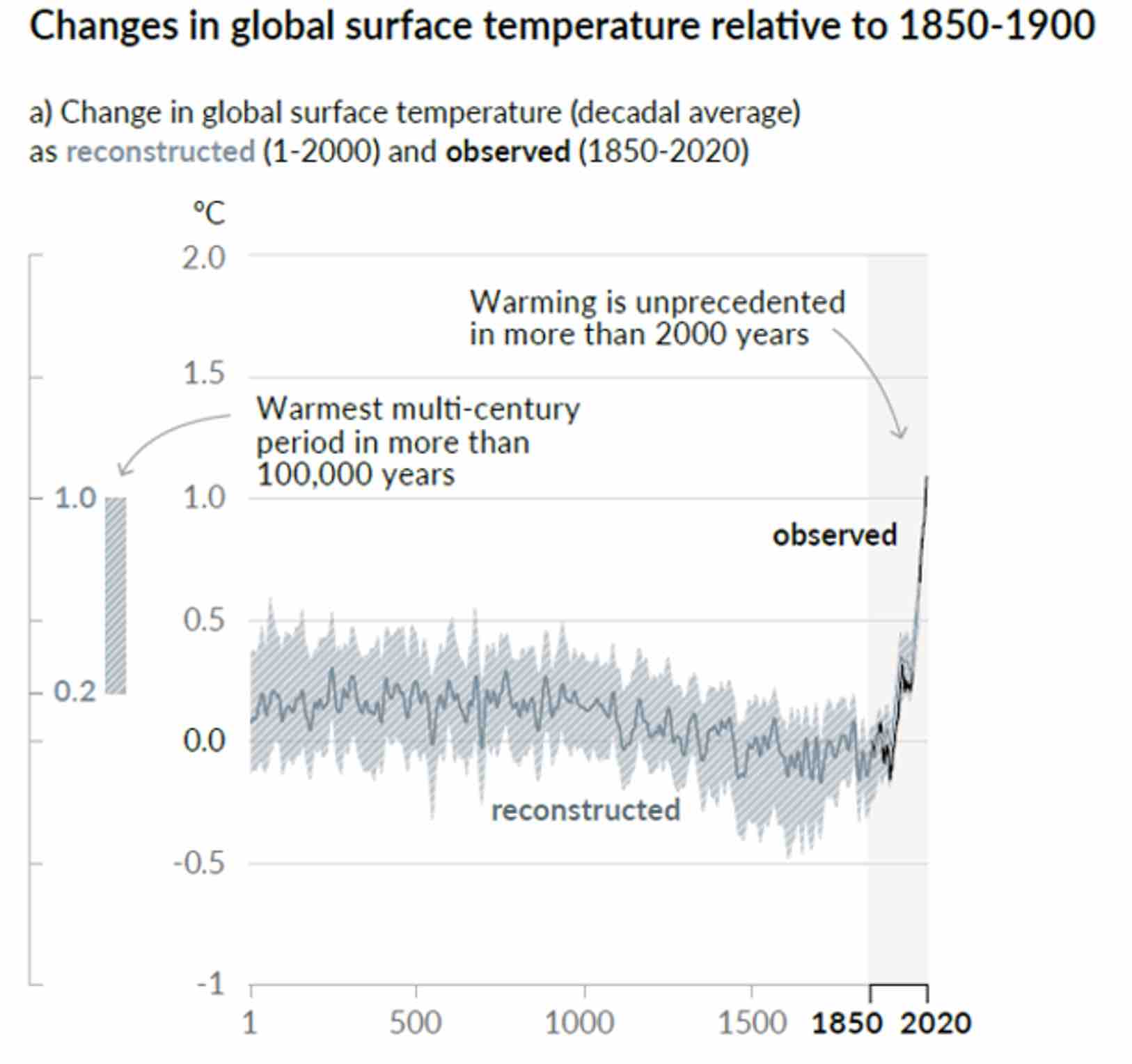
Steve Mc Intyre debunked already scientifically this new hockey stick curve in https://climateaudit.org/ .
In this note, we want only to demonstrate, by making use of a fictive example, some common methodological tricks used to build such a curve. For the fun of the exercise, we will put ourself in the shoes of an IPCC climatologist discovering data science, through some vulgarization book such as “data mining for dummies” or equivalent. These parodic parts of the paper are written in italic and put in word boxes to avoid any confusion.
The illustrative case
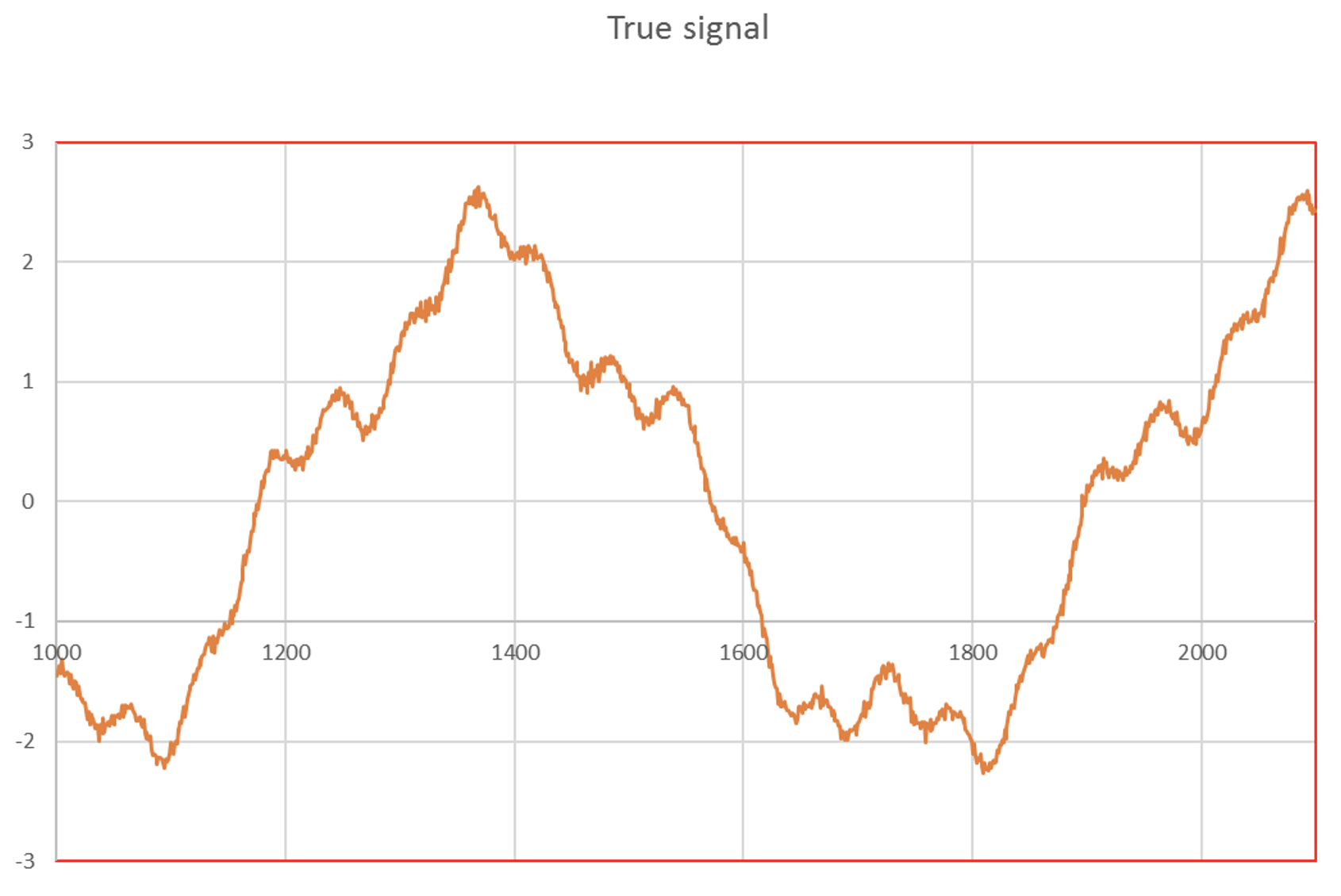
In this paper, It has been assumed that the temperature anomalies history could be reasonably simulated by superposing 3 sinusoids, allowing to reproduce very approximatively the medieval optimum (~ year 1 350), the Maunder (~ year 1650) and Dalton (~ year 1820) minimums and the present “pause (or “hiatus”) as shown on figure 2.
According to my distinguished colleagues of IPCC, those natural fluctuations must be separated from the anthropic contribution; these natural fluctuations must be considered as insignificant noise and handled as such.
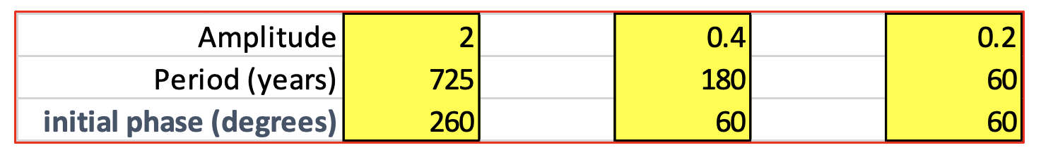
Table 1 gives details on the parameters used to construct these sinusoids.
The data used by IPCC for constructing this curve are a combination of many proxies for the data from the past, and direct temperature measurements for the most recent data (after 1980).
Proxies, as their name indicates it, are approximative estimators of temperature, but unfortunately, also, for some of them, of other factors like humidity, etc. The measurements made through those proxies are thus seriously corrupted by noise.
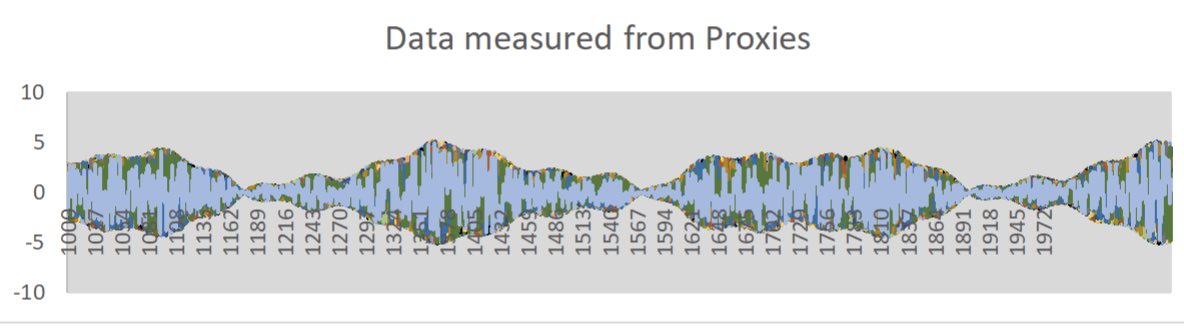
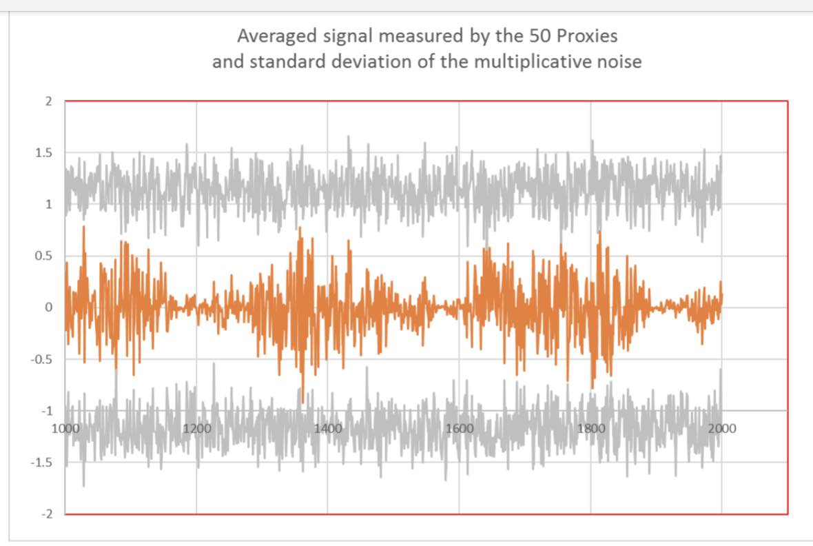
In the present paper, the measurements given by 50 proxies have been simulated by multiplying the “true signal” by random noise. This multiplication corresponds to calibration errors of the proxies. For the case considered, these random variables were ranging from -2 to +2 and spread over a period of 1100 years, lasting from year 1 000 to 2 100,with a time resolution of one year.
Fig 3 shows the “measured data” as collected from the 50 individual proxies.
We all know at IPCC that proxies are noisy. So, let us calculate their mean and standard deviation, as learned in secondary school.
For each year, the mean value, standard deviation and confidence intervals of the “measured” data have been constructed. Arbitrary, the confidence intervals were defined as the mean value + – the standard deviation, even though the distribution of the “measured” data is uniform around the sum of the 3 sinusoids simulating the “true” data, and not a gaussian distribution.
Data reduction
Fig 4 superposes the averaged simulated data as seen by the proxies to their mean standard deviation. Some points of the simulated data exceed the limits given by the standard deviation.
In the vulgarization book I opened to learn a little bit about data mining (not my speciality I am a glaciologist), I discovered that you need to clean your data and remove outliers, that are considered as “rogue” points, because those points result probably from some experimental error. Also, strangely, my data seems to be “pulsed” in cycles.
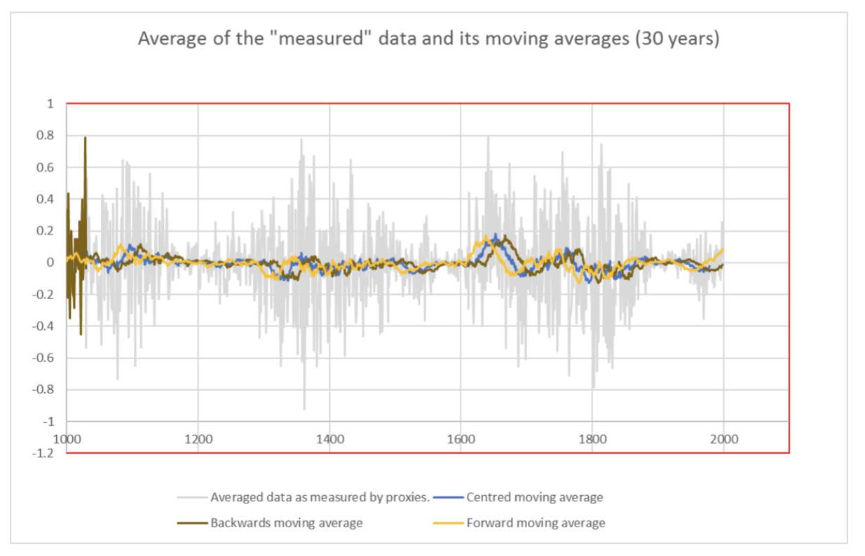
I discovered, by having a look at Wikipedia, that a better way to clean the data containing some outliers and cycles, is to apply some detrending technique, and that using moving averages for this purpose is usual practise (https://en.wikipedia.org/wiki/Moving_average ).
Having in mind that the WMO has put the hedge between meteo and climate at a duration of 30 years, it seems logical and coherent to me to detrend the data by making use of a moving average of total length equal to 30 years, and eliminating this way any meteorological interference.
By analogy with the concept of global temperature anomaly (and I went again to Wikipedia to refresh my memory on this specific concept that we are using extensively at IPCC as sole climate indicator: https://en.wikipedia.org/wiki/Temperature_anomaly ), a smoothing of the data by backwards moving average appears to be the most indicated procedure. However, wanting to show my computer skills, I made the graph given in Fig 5, where I compare the averaged “measured” data to a backwards, forwards and centred moving average of 30 years. Obviously, the centred one gives the best adjustment, by reducing the “edge effects” at the beginning and the end of the time window considered; As I want to be considered as a perfectionist by my colleagues, I will adopt this procedure.
Having in mind also that my colleagues at IPCC are separating the anthropic contribution to climate change from the natural ones, and are only focusing on the first one, I am convinced that this centred moving average will provide a reliable image of the anthropic contribution to climate change; and obviously, there is consensus among us to admit that the anthropic contribution is neglectable before the industrial revolution, what the detrending procedure applied to my data will confirm, I am sure of it !!!.
Fortunately things improve over time regarding the precision of temperature measurements; Since 1980 we have reliable thermometers readings confirmed by satellite measurements provided by the NASA.
On the other hand, we all agree at IPCC that there is no other explanation to the huge and extremely fast increase in temperature we observed since that date, than a massive contribution of anthropic greenhouse gases.
Starting from 1980, our data represents thus the current anomalies, and it is perfectly legitimate to add the measured temperatures since that date to the detrended data from the proxies.
With such a curve, I am pretty sure it must be easy convincing the policy makers that will attend the coming COP26 in Glasgow to put a lot of money on table. This will, of course “cascade” in a way or another as nice further grants for my research activities, that remained quite confidential before the climate hype. If not, I will have to find another job.
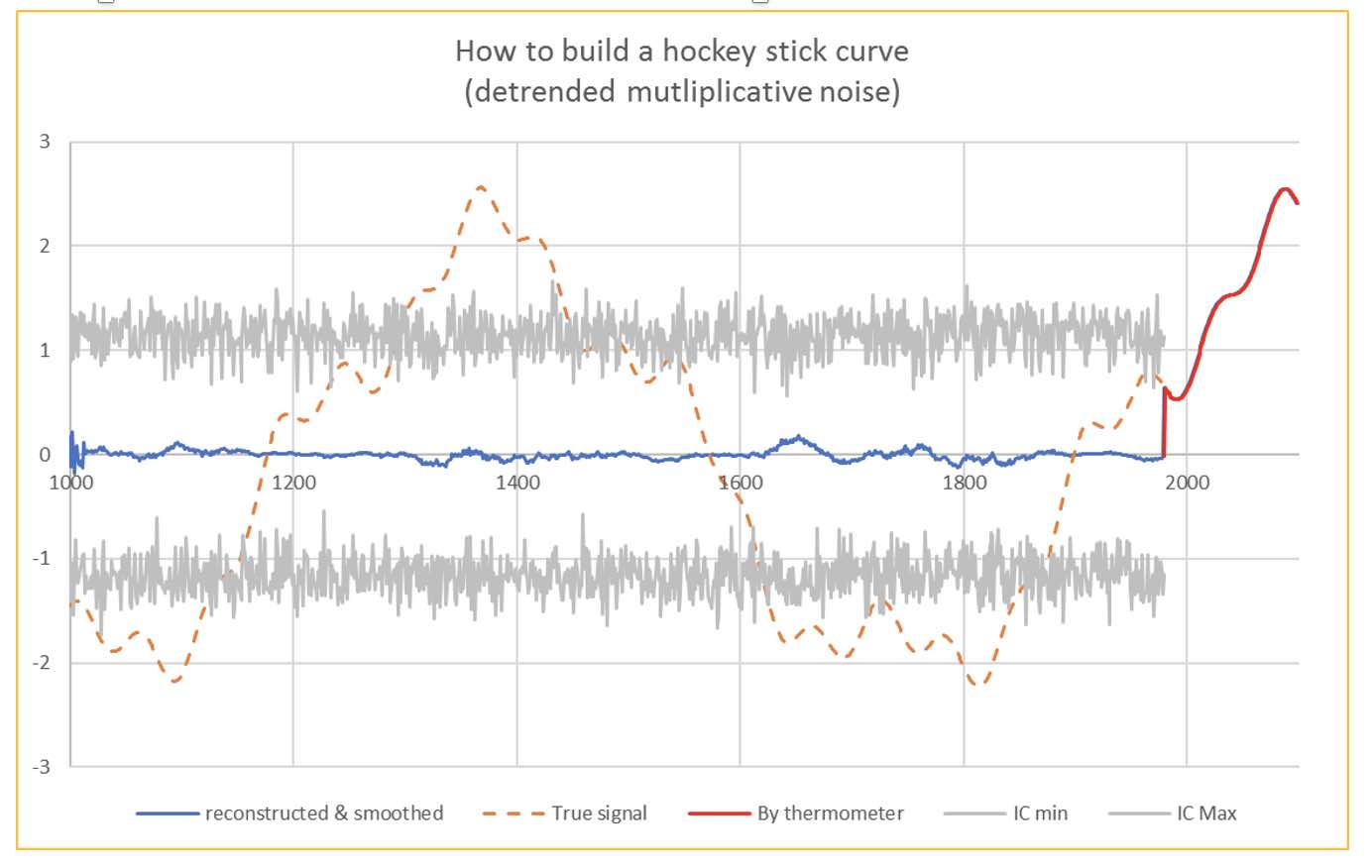
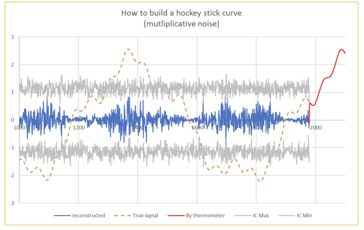
I am very happy to have been clever enough to detrend successfully the measurements made by proxies, otherwise, my graph would, of course, still have been convincing… but less, as shown on Fig. 7, and some climato-sceptics could focus on the remaining cycles, even if they are not very significant, falling inside the confidence interval, which allows me to consider them as noise.
Conclusion
The hockey stick graph given in fig 6, which is supposed to be a reliable image of the “raw data” presented in fig 2, is a “fake” and results from misuse of data mining techniques, based on fairy hypotheses that cannot longer be accepted. As an exercise in critical thinking, the reader is invited to find the intentional methodological bugs introduced in this parodic note.
Additional material:
The figures of this note have been made on an Excel spreadsheet available on demand.
Conflict of interests
The author certifies that there is no conflict of interest, and that no funding has been provided from any source to cover this work.
Further reading
IPCC AR6 and SPM (Summary for Policy Makers) https://www.ipcc.ch/assessment-report/ar6/
J. Hyndman and G. Athanasopoulos, Forecasting https://otexts.com/fpp2/
Dr Tim Ball – Historical Climatologist
http://www.generalistjournal.com
Book: ‘The Deliberate Corruption of Climate Science’
Book: ‘Human Caused Global Warming, the Biggest Deception in History’
https://www.technocracy.news/dr-tim-ball-on-climate-lies-wrapped-in-deception-smothered-with-delusion/
https://www.youtube.com/watch?v=tPzpPXuASY8
Je suis positivement surpris de constater que SCE est même lu par de grands climatologues internationaux ! Manquerait plus que Lindzen, Christy, Spencer et Curry et les meilleurs auront déjà consulté ce site ! ☺
Excellente démonstration!
Cher auteur,
Merci une fois de plus pour votre contribution à démonter cette ineptie du réchauffement climatique d’origine anthropique.
Question : quand le GIEC en est amené à introduire une resucée de la courbe de Mann dans son dernier rapport, ne faudrait il pas voir cela comme une preuve qu’ils sont à bout de souffle dans leur campagne de terreur?
Dans l’attente de vous lire.
J’espère que vous avez raison
Je l’espère aussi, mais ne rêvons pas trop : nous avons à faire à un phénomène de nature religieuse doublé d’une peur de fin du monde, cela arrive assez régulièrement dans l’histoire.
Des enjeux financiers et politiques colossaux prennent actuellement le dessus sur tout raisonnement et toute rationalité : les politiques sous couvert d’écologie et en s’autoproclamant sauveurs de la planète se déconnectent complètement des réels besoins de la population.
Le réveil promet d’être très dur…
Au plaisir de discuter!